
This map is found on the website, "Who's Your City", by Richard Florida. This is a map of the United States of American with indications of several metro areas. There are blue and red circles on the map where blue circles represent the number of single men and the red circles represent the number of single women. And the size of the circles indicates how many more single men or women are there in each metro area. It shows on the map that there are more blue circles on the west side and there are more red circles on the east side. I find this map interesting that there seems to be more single men in West United States and more single women in East United States. In N.Y., Northern N.J, there are 210,820 more single women than men, while in L.A, Long Beach, and Santa Ana, there are 89,459 more single men than women! Perhaps this is because that the women on the East Coast are more independent and they do not need to marry men and can still provide for themselves.
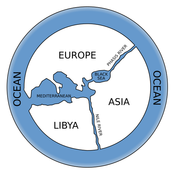
This is a map that is found in the article, "Early World Maps," of Wikipedia. This is a reconstruction of Anaximander's map. Anaximander is known for creating one of the first maps of the world. On the map Anaximander drew, it shows that the world is shaped in circle with the three continents, Europe, Asia, and Libya, while Europe and Asia are divided by the Black Sea and the Phasis River, Asia and Libya are divided by the Nile River, and Europe and Libya are separated by the Mediterranean Sea. And all these continents are surrounded by the ocean. I think it is really interesting that back in the ancient time, people believed that there are only three big lands, two rivers, and two seas in the entire world. However, I am pretty surprised that Anaximander drew the map in the shape of circle, which means that by the time, people have already known that the world is a circle, rather than a flat surface.

This is a map from the blog, "Amazing Maps," and it shows the numbers of Starbucks stores in each country in 2003. This map also shows the countries of coffee bean source, paper source for cups, and sugar source. The map indicates that the United States and Canada has the most Starbucks stores within the Western Countries, while within the Eastern countries, Japan has the most Starbucks stores. On the map, it shows that there are many countries that provide coffee bean to Starbucks, and most of the paper sources are from North European countries and some are from Canada. And sugar sources are mostly from Brazil and Australia. I find this map really interesting because it shows that how much Americans like Starbucks! And I believe this is the reason that Starbucks stores have been increasing their numbers in the United States. Also, I find another thing that is interesting is that Japan is the top three countries that has the most Starbucks stores! I have always thought that Starbucks is more like a Western culture thing, but this map shows that many Eastern countries like Starbucks just as much as the Westerners!
No comments:
Post a Comment